THE PROJECT
Our first project this semester is called, “Identity.” The idea is for each of us to come up with our own personal brand mark. I’ve already made several logos for myself, but #1 they weren’t very good and #2 they were different for each kind of media (ie photography, resume, graphic design, etc). With this project, I will make a logo that will represent me across all platforms and mediums. This project is all about rebranding and I loved it!
We made three different vectorized brand marks with one that had a graphic image logo. We had to have an appropriate color scheme and clean crisp lines. We were graded on a wide range of things, including these.
I AM SQUIRTLE
For part of this project, we had to research ourselves. This was done through sleepless nights of desperate introspection and a Facebook survey. I had to ask people in my network something that scared the livin’ daylight out of me! I had to ask them what they really thought about me. To accomplish this, I simply posted this on Facebook and Twitter: “I have to rebrand myself for an assignment! Please help by responding to this question: When you think of Kyle Treasure, what words/ideas come to mind?”
From this, I discovered that people think that I am kind, generous, and confident. I learned that people associate me with social media. I learned that people think I’m like Squirtle, (of Pokemon fame). I also learned that people find me creative and talented. They also said that I’m dangerous and fun. I decided to embrace this view of myself and incorporated these into my logos.
THE REASON YOU’RE READING THIS
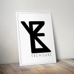
Without any further adieu, here are my final logos!
![]()
Logo #1
This logo is my favorite. I love it. I already put it on my resume. I’m committed. You could still change my mind. Probably. I think this one is the most professional and works best with my PR profession. I like how bold it is. That was how I represented my confident side. I also applied my generous side to this. It’s bold, yet unobtrusive. It kind of blends in to the background and doesn’t steal the show.
![]()
Logo #2
This logo is all about my social media presence. I designed it to look like a social media icon. But I also wanted to incorporate the talented and creative side of myself. So I put in a cursive T made my mine own hand.
![]()
Logo #3
This logo is my second favorite. It reminds me of a clothing company logo! I think this logo shows off my DANGEROUS side. It’s a risky design, but I think it works. It’s also fun and it kind of reminds me of Squirtle. (Squint your eyes… like almost close them… then you can see it.)
MY STRUGGLES
During this project, I struggled to create a logo that I liked. For a while there, I didn’t like any of the logos I made. I overcame this by simply continuing to design. I made variations of the logos I had and eventually came up with stuff I liked. I also sought inspiration from classmates. The other struggle I had was getting things to be totally transparent where I wanted them to be, particularly in the first logo. To resolve this, I asked Brother Lybbert and he showed me how to do this. Those were my main struggles.
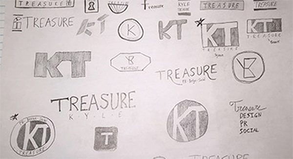
MY SKETCHES
VECTORIZING ASSIGNMENT
I struggled with my vectorization, but I persevered. It took many adjustments and sleepless nights, but I got there!
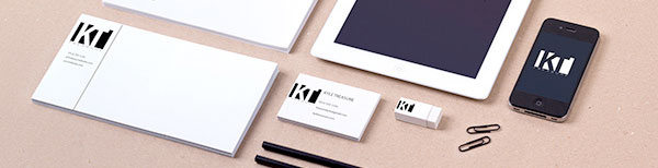
Making a Decision
To help decide which logo I liked the best I used Photoshop mockups to see what each would look like in real applications. I LOVE mock ups! So, here you go!
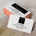
THE FINAL
Here you will find the final version of my favorite logo. I included both a normal version and a banner version.
![]()
Thank you for browsing my first project of the semester! I hope you enjoyed my designs! Feel free to leave a comment (as long as it’s nice) below and add me on Twitter: @KyleTreasure!
Recent Comments